


Verizon Smart Family gives parents the ability to track their children’s location, monitor online activity, and filter bad content.
The app’s latest feature “Driving Insights” records a child's driving trips and detects potential crashes.
Although Verizon’s crash detection feature was functional, it was impossible to prevent false positive alerts, which led to parents being alarmed unnecessarily. I was tasked with finding a way to restore user trust while also preventing as many future false alarms as possible.
How might we create a user-friendly feedback system and address faulted alerts?
Legal constraint:
Feedback on Crash Detection's performance has to come from a parent or guardian.
Technical constraint:
The only way to determine whether a crash actually occurred is by asking users directly.
Scope constraint:
The design must not drastically change the feature to minimize engineering L.O.E. (Level of Effort)
For this project, our main users are parents of kids ages 15 to 21. Our secondary users are the kids who drive in the family. Younger kids are not directly involved but I’ve considered their impact as family members.
I was the Product Designer on this project. I designed the end-to-end feature experience, conducted the usability test, spoke with stakeholders and prepared final designs for engineering handoff.
I worked closely with our internal Product Manager, the external client team from Verizon, the Research Team, and a UX Copywriter. I also routinely shared and received feedback from the design team.
The "Driving Insights" feature was originally designed by another team and inherited by me. I was able to turn an untested product into a fully designed crash detection experience that has been tested and validated by real users.
Receiving an alert about your child potentially being in a car collision is a scary thing. Before I began, I wanted to understand what parents would do upon receiving a crash alert from their child. Our research team conducted interviews on this subject with eight parents.
When asked what are the first things they would do when receiving notification about a crash their child is in, parents revealed they would:
1. call the child
2. check the site of the crash on the map
3. look for something that says the child is alright.
This allowed me to understand the users' tasks and mindsets and then create user stories based on this information. It also confirmed that parents were looking for the accuracy of the alert and we should look for ways to help them discern it.
In order to prevent false alarms, we needed to find a way to ask parents to confirm or deny the crash. Following the user tasks and journey, it’s clear that parents would have the ability and emotional willingness to help confirm whether it was a real crash or not after they have addressed the situation surrounding the crash alert.
I explored different flow variations for parents to confirm or deny the occurrence of a crash. I placed it after parents dismissed the crash alert or when they did something unrelated to the crash alert.
Flow 1
I first experimented with the crash confirmation as a series of pop-up dialogues that appear after an alert is dismissed.
I found that having a series of pop-up was disruptive and increased user error so began considering combining the pop-ups or removing them entirely.
Before removing the first pop-up, I wanted to know if the question it asked was valuable to the parents. Do parents wanted to keep the crash information even if they confirmed it wasn't a crash? I decided to ask this question in the usability test later on.
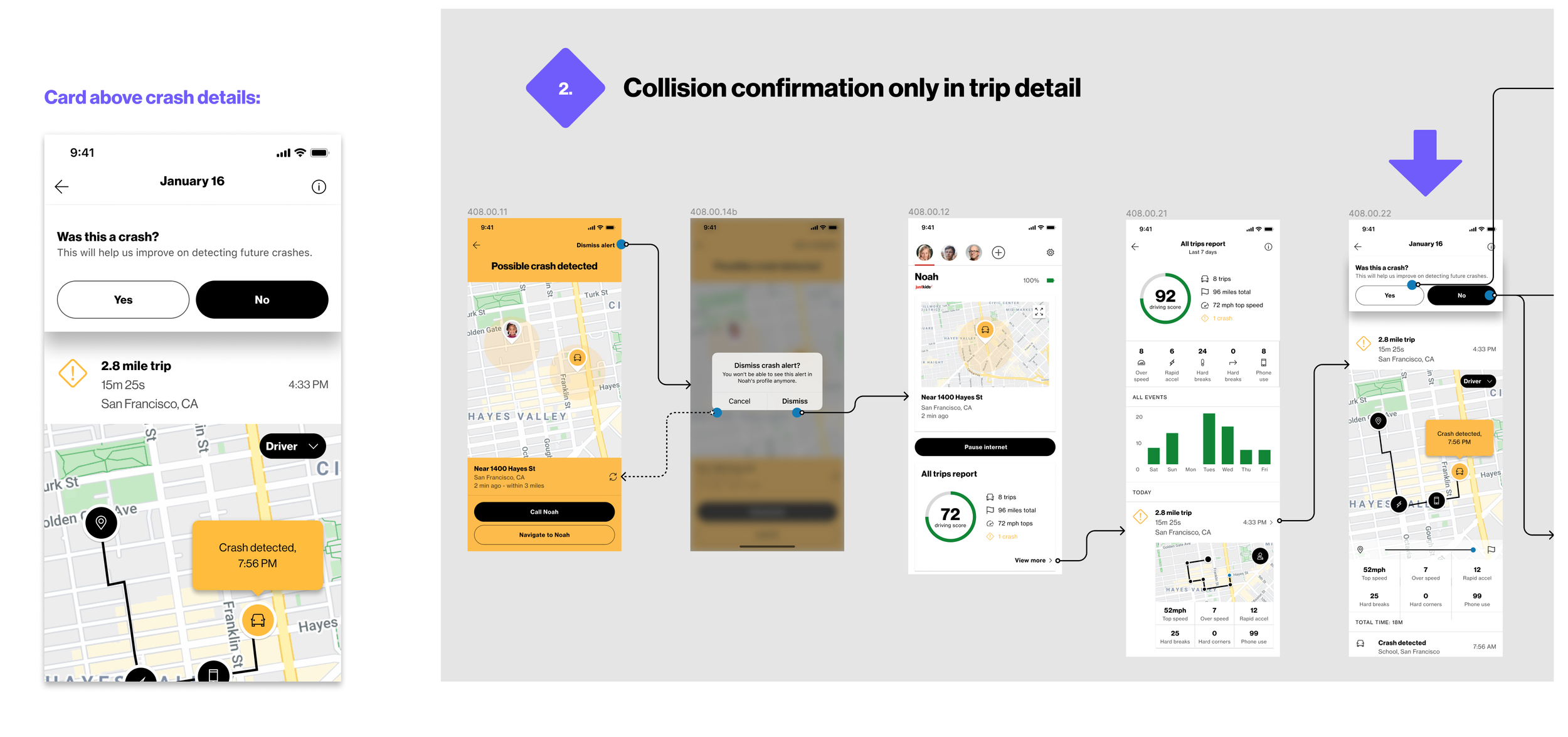
Flow 2
Then I tried the crash confirmation as a card that appeared when parents accessed the trip details from the home page.
This solution was less interruptive, but also had lower visibility and risked not getting the confirmation.
We decided to test both flows for usability.
Final Flow
Test participants appreciated the directness of the pop-up to confirm the crash. They also mentioned they wanted to keep the crash data even if it turned out to be a false crash. So I simplified the pop-ups and let users know the crash data is available if they ever wanted to go back. I also kept the card above trip detail to catch any users who bypass this flow.
Even if parents confirmed it wasn’t a crash, our app still caused them a great deal of stress.
How can we keep the parent’s trust, and how can the feature keep hold of its integrity and value?
We explored a couple of ways to tackle this.
Solution A
One idea was asking the parents to classify the cause of the false crash alert after they confirmed or denied it. The follow-up shows curiosity, and it adds more value to the confirmation.
Solution B
In order to add value to the feature, I decided to add additional user insights to the collision confirmation. The idea is that the feedback the users' give would give an update on the map, location history, and let their family members know that everything is okay.
A sensitive tone of voice for this topic is extra crucial. I worked with our UX copywriter to make sure the copy is empathetic yet concise.
Child App
In addition to creating solutions in the parents' app, I designed an interaction in the child's app to facilitate timely communication between the parents and children. The ability for the children to communicate whether or not they are okay is vital to potential family emergencies because it allows parents to know what their next course of action should be and prepare accordingly.
The above solutions were then tested on eight groups of parents who have children drivers between the ages of 15 and 21.
The Good
- Parents liked classifying the cause of the crash alert because it helped them understand why it happened and could potentially be a good learning experience for their child.
- Parents wanted the final confirmation on whether it was a crash or not to come from them instead of the child, which aligned with the legal requirement given to us by the lawyers.
Constructive Feedback
- If parents get too many false alarms, the app will lose its value.
My designs got approval from Verizon and were handed off to the engineering team to be built. However, the client changed the product roadmap and it never got developed.
Regardless, I learned a tremendous amount about our users and legal requirements surrounding this field. I got to collaborate with a passionate team and we worked together to come up with solutions to a challenging problem.